Google Maps' Leaf Icon: Understanding Eco-Friendly Routes and User Confusion
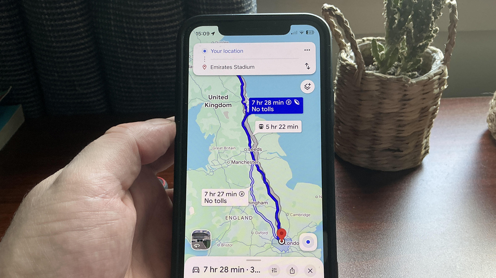
Google Maps offers an eco-friendly routing option, indicated by a leaf icon, designed to help users choose more fuel-efficient travel paths. This feature aims to reduce carbon emissions by prioritizing routes that are estimated to consume less fuel. However, the functionality and implications of this icon have led to significant user confusion. Many users are unaware of what the leaf icon signifies or how it impacts their navigation choices. The feature is intended to provide an alternative to the fastest or shortest routes, focusing instead on environmental impact. While the intention is to promote sustainable travel, the lack of clear communication or intuitive design has hindered its widespread understanding and adoption. Users are encouraged to explore these routes to potentially contribute to reducing their carbon footprint. Understanding the nuances of this feature is key to leveraging its environmental benefits effectively.
The introduction of eco-friendly routing by Google Maps reflects a growing integration of environmental considerations into mainstream technology platforms. While the leaf icon serves as a visual cue, its effectiveness is hampered by user comprehension challenges, suggesting a gap between technological innovation and user education. Future iterations could benefit from more explicit in-app guidance or contextual explanations to clarify the benefits and trade-offs of selecting eco-friendly routes. This initiative highlights the evolving role of tech companies in influencing consumer behavior towards sustainability, presenting both an opportunity and a responsibility to clearly communicate the impact of user choices.
AI-generated to prompt reflection — not editorial opinion, not advice, not a statement of fact. How this works.