Mapfre's Logo Evolution: Reflecting a Century of Change
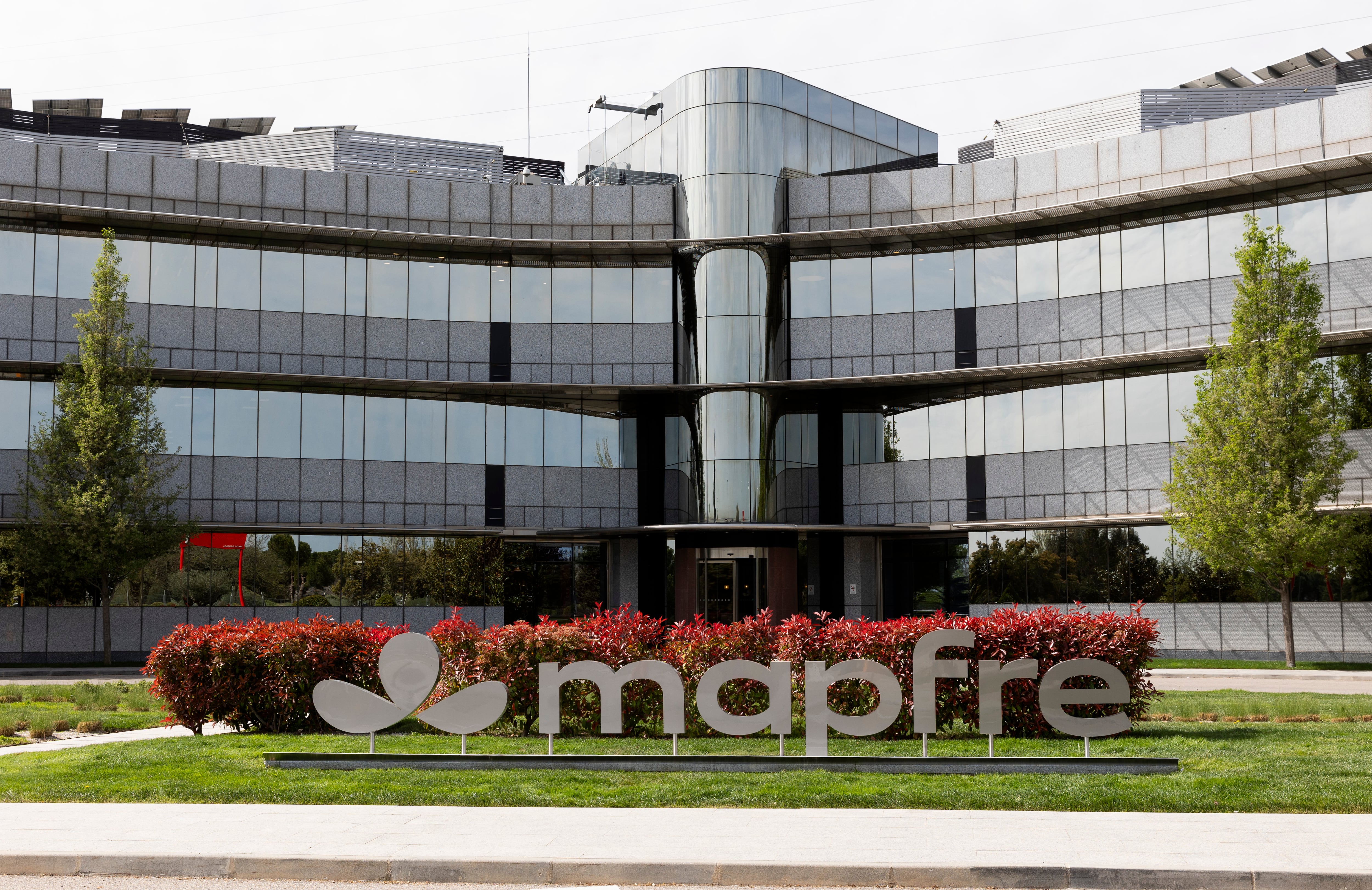
Mapfre, a nearly century-old company, has significantly evolved its graphic identity over time, mirroring its changing approach to providing security and trust to society. The company's visual branding has transformed from functional policies to artistic designs, featuring contributions from renowned artists such as Rafael de Penagos and Alberto Corazón. Each logo alteration signifies a distinct phase in Mapfre's corporate development. The most recent redesign project spanned a total of two years of dedicated work.
Mapfre's strategic decision to update its globally recognized logo reflects a common corporate imperative to align brand identity with evolving market perceptions and service offerings. This process, involving significant investment in time and artistic collaboration, suggests a deliberate effort to maintain relevance and reinforce its image of stability. The evolution from functional designs to artistic expressions indicates a shift towards emphasizing brand storytelling and emotional connection, a trend amplified in the digital age. Such rebranding initiatives, while costly, are often viewed as essential for navigating competitive landscapes and demonstrating adaptability to societal expectations over the long term.
AI-generated to prompt reflection — not editorial opinion, not advice, not a statement of fact. How this works.